Profiling my favourite songs on Spotify through clustering

Music plays an integral part of most of our lives. It is the common language that helps us express ourselves when no words could describe how we feel. Music also helps us set the mood. It affects our soul and our emotion, making us feel happy, sad or energetic. We will probably be playing songs to sing along during our long drives, or listening to upbeat songs during our gym sessions.
Many of us have specific tastes in the music we listen to and it may change from time to time. This got me thinking…
Have my taste in music changed over the years? If so, when did the changes occur? Based on my recent taste in music, what type(s) of music am I listening to now? Thanks to Spotify API, I am able to extract and explore the songs I enjoy listening to — the ones that made me click that heart icon.
Setup
To get the data from the Spotify API, we will need to do an initial setup with the following steps:
- Login to Spotify for Developers and create an app.
- From the application dashboard page, select edit settings and set Redirect URIs as
http://localhost:8888. - Take note of the Client ID and the Client Secret.
Gathering data
We can use Spotipy, a Python library for the Spotify Web API, to get the relevant data. To get the songs, we need to generate an authorization token.
import spotipy
import spotipy.util as util
from spotipy.oauth2 import SpotifyClientCredentials
cid = '<INSERT CLIENT ID>'
secret = '<INSERT CLIENT SECRET>'
username = ""
client_credentials_manager = SpotifyClientCredentials(client_id=cid, client_secret=secret)
sp = spotipy.Spotify(client_credentials_manager=client_credentials_manager)
# Get read access to your library
scope = 'user-library-read'
token = util.prompt_for_user_token(username, scope)
if token:
    sp = spotipy.Spotify(auth=token)
else:
    print("Can't get token for", username)
There are two APIs, current_user_saved_tracks and audio_features, to get the title, artist, time song was added, and features such as acousticness, danceability and instrumentalness. These features will help us in understanding our playlist better.
Some of the description to the features are in the table below:

To view the full features of a song, you may view this link.
df_saved_tracks = pd.DataFrame()
track_list = ''
added_ts_list = []
artist_list = []
title_list = []
more_songs = True
offset_index = 0
while more_songs:
    songs = sp.current_user_saved_tracks(offset=offset_index)
    for song in songs['items']:
        #join track ids to a string for audio_features function
        track_list += song['track']['id'] +','
        #get the time when the song was added
        added_ts_list.append(song['added_at'])
        #get the title of the song
        title_list.append(song['track']['name'])
        #get all the artists in the song
        artists = song['track']['artists']
        artists_name = ''
        for artist in artists:
            artists_name += artist['name']  + ','
        artist_list.append(artists_name[:-1])
    #get the track features and append into a dataframe
    track_features = sp.audio_features(track_list[:-1])
    df_temp = pd.DataFrame(track_features)
    df_saved_tracks = df_saved_tracks.append(df_temp)
    track_list = ''
    if songs['next'] == None:
        # no more songs in playlist
        more_songs = False
    else:
        # get the next n songs
        offset_index += songs['limit']
#include timestamp added, title and artists of a song
df_saved_tracks['added_at'] = added_ts_list
df_saved_tracks['song_title'] = title_list
df_saved_tracks['artists'] = artist_list
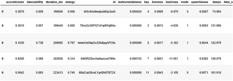
Here is a sample of the data set obtained.
Did my taste in music change?
After obtaining the data, it is time to find out how the features change across time. We can group the songs by its added year and month, get the average for each feature over time and visualize it.

The line graph was separated by year to make it more bite-size. Speechiness (in violet) is the most stable closer to 0 across the years. This indicates that I generally listen to songs which are less rap. Acousticness (in blue) is fluctuating which means that I have a mix of acoustic and non-acoustic songs over time.
What interests me the most was instrumentalness (in green). For the year of 2015 and 2016, it was stable closer to 0. However, from 2017 onward, instrumentalness started to fluctuate. This is probably the indication that my music taste changed from 2017. We can filter our data to songs which were added from 2017.
What types of songs am I listening to?
Clustering
Based on the chart above, I know that I am listening to more instrumental songs. But is it instrumental dance kind of songs? Or more classical songs? What about the others? What is my current taste in music? We could group songs with similar characteristics together, and profile each cluster. One type of clustering method is K-means Clustering which is what I will be using to analyse my songs.
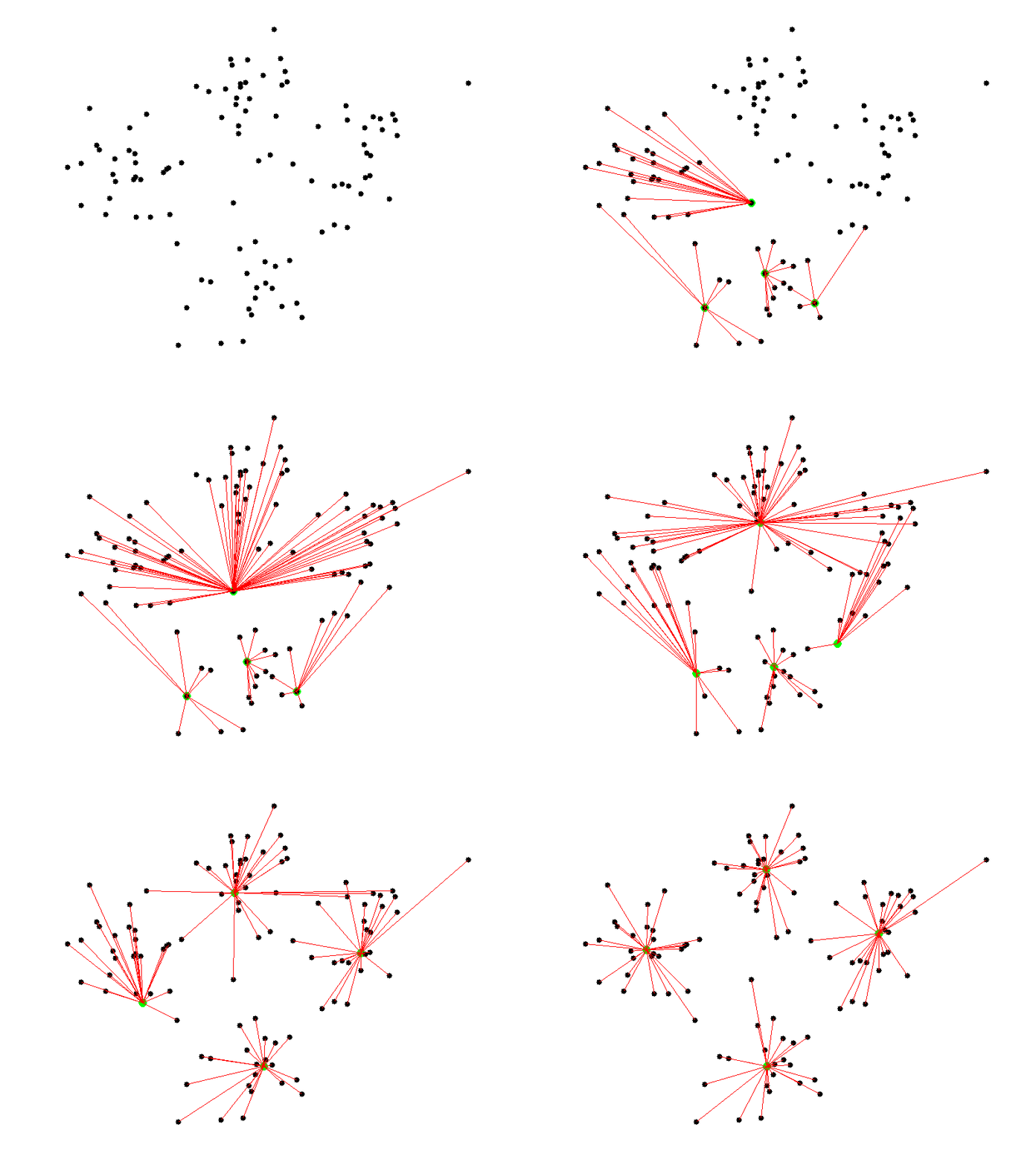
For clustering, we want the points in the same cluster to be as close as possible. We also want the distance between clusters to be far from each other as possible. This makes each cluster look compact while being spaced out from each other.
Here is a visualization of what clustering looks like for 4 clusters. The green dot represents each cluster centroid (centre of the cluster).
Because clustering relies on distance, the scale of our data will affect the results. For example, if we want to cluster by height, from 1.5m to 1.9m, and weight, from 60kg to 80kg. Thus, the points spreads across the height axis by 0.4 and the weight by 20. This means that weight will be dominant in determining the clusters.
We can standardize the range of the data such that the features will influence the result.
cluster_features = ['acousticness', 'danceability', 'instrumentalness', 'energy', 'speechiness']
df_cluster = df_recent[cluster_features]
X = np.array(df_cluster)
scaler = StandardScaler()
scaler.fit(X)
X = scaler.transform(X)
After getting an idea of what clustering does, how many types/groups of songs do we listen to? One way is to make an educated guess based on your own knowledge. If you listen to all types of music from edm to hip hop to jazz and many more, you can give a higher number like… 7 maybe? Because K-means clustering requires us to specify the number of clusters we want, we can set k=7, where k is the number of clusters.
Another way is to use the help of the elbow method to determine the number of clusters. In the elbow method, we can perform clustering for a range of set cluster numbers, e.g. k=1, k=2, …, k=9, k=10. For each k, we will take each point and measure its squared distance to their cluster centroid, and sum them up. This is called the sum of squared distances (SSD). SSD measures how close each points are to the cluster centroid. Therefore, the smaller the SSD, the closer the points in the same cluster are.
ss_dist = []
K = range(1, 11)
for k in K:
    km = KMeans(n_clusters=k, init='k-means++', random_state=123)
    km = km.fit(X)
    ss_dist.append(km.inertia_)
plt.plot(K, ss_dist, 'bx-')
plt.xlabel('k')
plt.ylabel('Sum of squared distances')
plt.title('Elbow Method For Optimal k')
plt.show()
So if we plot the SSD for each k we will get curved line as shown below:
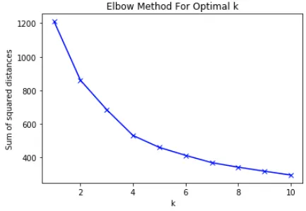
From the plot above, as k increases, SSD decreases. This is makes sense because points may have a closer cluster to be assigned to, resulting in a lower SSD.
Earlier, I mentioned that we want the points in each cluster to be as close as possible. However, we cannot choose k=10 because it is the lowest. Imagine this. If we choose k=N, where N is the number of songs, we are having each song as its own cluster and thus SSD will be 0. This is because the cluster centroid of each point is the point itself.
Instead, we are going to choose k such that if we add another cluster, SSD decreases slightly. This is known as the elbow method. If we think of the curve as our arm, we get a steep slope at the beginning which suddenly becomes gentle midway. This gives it its “elbow” shape.
Based on the elbow method, the number of clusters recommended is 4 because the line became gentle from k=4 to k=5. However, I’ve also played around with k=5 and found that I like the clusters given. Therefore, in this post I will be sharing the results I got for k=5 instead.
Cluster Visualization
Great we finally have our cluster! So how does our cluster look like? Unfortunately, at this we are unable to view it yet. This is because our clusters are formed using 5 features. If you think of each feature as a dimension, you get 5-D. As we can view images up to 3-D, we will need to perform a technique called dimension reduction. This allows us to reduce from 5-D to any dimensions lower.
To try and explain it as intuitively as possible, dimension reduction aims to make a low dimensional set of features from a higher dimension while preserving as much information as possible. If you wish to get a better understanding of what it does you may watch this video about Principal Component Analysis(PCA), which is one of the methods in dimension reduction.
Let’s see how much data is preserved if we use PCA to reduce the dimension.
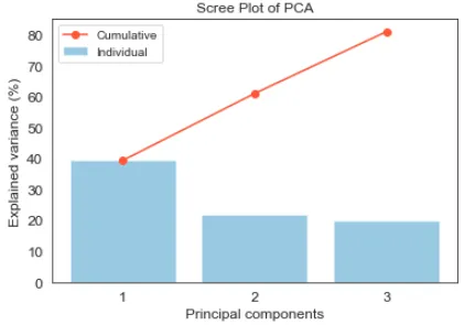
The blue bar shows how much information each principal component (PC) contributes to the data. The first PC contributes 40% of information about the data. The second and third contributes 20% each. The red line shows the cumulative information of the data by the PCs. By reducing from 5 dimensions to 2, 60% information of the data is preserved. Likewise if we were to reduce to 3 dimensions, 80% information of the data is preserved.
Now let’s see how our clusters look like on a 2-D and 3-D scatter plot.
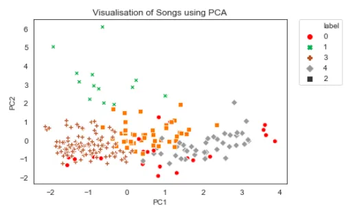
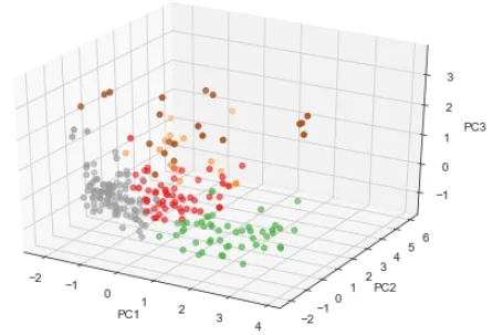
The points in the 2-D scatter plot overlaps with each other and may not look like the clustering was done well. However if we were to view it from a 3-D perspective, we can see the clusters better.
Let’s try another method called t-Distributed Stochastic Neighbor Embedding(t-SNE). t-SNE performs well for visualizing high dimension data. For more details, you may read this tutorial by datacamp.
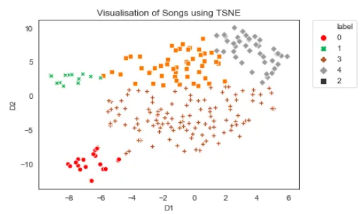
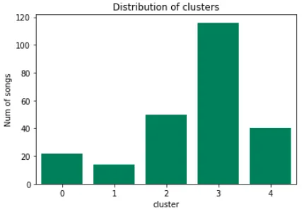
In this case, a 2-D t-SNE scatter plot is able to visualize the 5 clusters nicely. We can also roughly tell that cluster 3 is the biggest cluster and cluster 0 or 1 is the smallest. Let’s see how the clusters are distributed using a bar chart.
Cluster Profiling
Now, we can make sense of what the characteristics of the different clusters are. Let’s compare the distribution of features across clusters.
# set binning intervals of 0.1
bins = np.linspace(0,1,10)
# create subplots for number of clusters(Rows) and features(Cols)
num_features = len(cluster_features)
f, axes = plt.subplots(num_clusters, num_features,
                       figsize=(20, 10), sharex='col'
row = 0
for cluster in np.sort(df_recent['cluster'].unique()):
    df_cluster = df_recent[df_recent['cluster'] == cluster]
    col = 0
    for feature in cluster_features:
        rec_grp = df_recent.groupby(pd.cut(df_recent[feature], bins)).size().reset_index(name='count')
        cluster_grp = df_cluster.groupby(pd.cut(df_cluster[feature], bins)).size().reset_index(name='count')

        sns.barplot(data=rec_grp, x=feature, y='count',
                    color='grey', ax=axes[row, col])
        sns.barplot(data=cluster_grp, x=feature, y='count',
                    color='red', ax=axes[row, col])
        axes[row, col].set_xlabel('')
        axes[row, col].set_xticklabels(range(1,10))
        if col > 0:
            axes[row, col].set_ylabel('')
        if row == 0:
            axes[row, col].set_title(feature)
        col += 1

    row += 1

f.suptitle('Profile for each clusters')

plt.show()
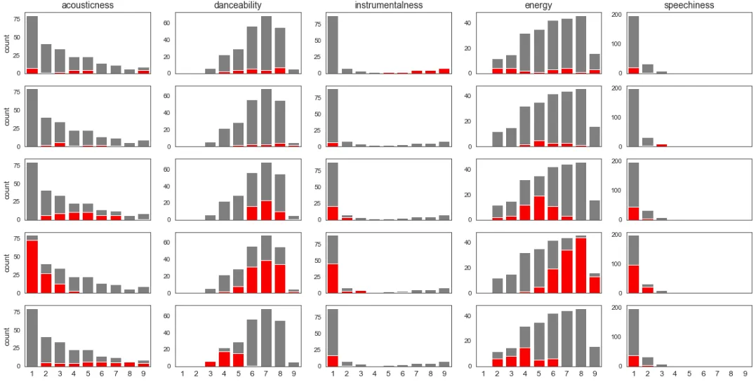
Each Row represents the cluster, 0 to 4, and the each Column represents the feature. The grey bar represents the distribution of the feature. This allows us to get a rough idea of the distribution of the feature. The red bar represents the distribution of the feature in that cluster which is used to compare against the other clusters.
When we look at the distribution of each cluster we can see that each cluster is high or low in certain features. This is identified by whether the red bar is on the right(high) or left(low) with respect to the grey bar. From these characteristics we can profile them and even come up with a cluster identity.
Cluster 0 (Instrumental): High instrumentalness. Low speechiness.
Cluster 1 (Lyrical): High danceability, energy, speechiness. Low acousticness, instrumentalness.
Cluster 2 (Chill vibes): High danceability. Low energy, instrumentalness, speechiness.
Cluster 3 (Dance): High danceability, energy. Low acousticness, instrumentalness, speechiness.
Cluster 4 (Wind down): High acousticness. Low danceability, instrumnetalness, energy, speechiness.
We can also profile by taking the average of the cluster feature and plotting them onto a radar chart. This might be easier to view the differences between all the cluster at a glance.

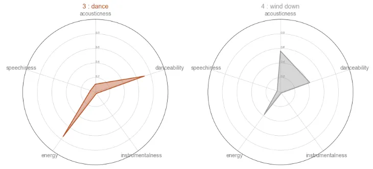
The readings of the radar chart is similar to the profile given above. We can also see that cluster 2 and 4 have a similar stats. The difference is that cluster 2 is more focused on danceability and cluster 4 is more focused on acousticness.
Cluster sample
Let’s see if the songs in each cluster fits the cluster profile. Here are 3 songs in each cluster and you can give it a listen and see if it makes sense:
Cluster 0 (Instrumental)
- Go Back Home by FKJ
- Hypnotised by Coldplay
- Libertango by Astor Piazzolla, Bond
Cluster 1 (Lyrical)
- September Rose by Cailin Russo
- Candlelight by Zhavia Ward
- BBIBBI by IU
Cluster 2 (Chill vibes)
- Drop the Game by Flume, Chet Faker
- Livid by ELIZA
- Find a Way by Matt Quentin, Rinca Yang
Cluster 3 (Dance)
- Ultralife by Oh Wonder
- Little Man by The Pb Underground
- Finesse (Remix) [feat. Cardi B] by Bruno Mars,Cardi B
Cluster 4 (Wind down)
- Frozen by Sabrina Claudio
- Break the Distance 2.0 by Ashton Edminster
- Someone To Stay by Vancouver Sleep Clinic
Conclusion
We first looked at the different features over time and try to figure out if there was a shift in music taste. From the filtered data set, we performed our cluster analysis. We then visualized to get a rough idea of what it looks like and to ensure that the clustering is fine. Finally we plotted the distribution of each feature and profiled them. At the end of the day, we are able to get a better understanding of the type of songs that we like.
The collection of data can be found here and the analysis can be found here on my Github.
Enjoy Reading This Article?
Here are some more articles you might like to read next: